SHORTFILM: The Drawing Machine - 1947 Sunbeam Illustration by Bryon Fitzpatrick
/
One of my favorite instructors from design school - Bryon Fitzpatrick.

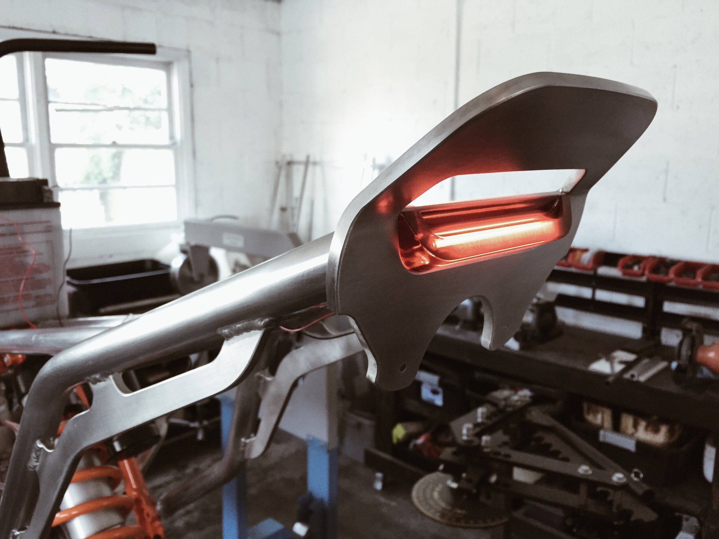
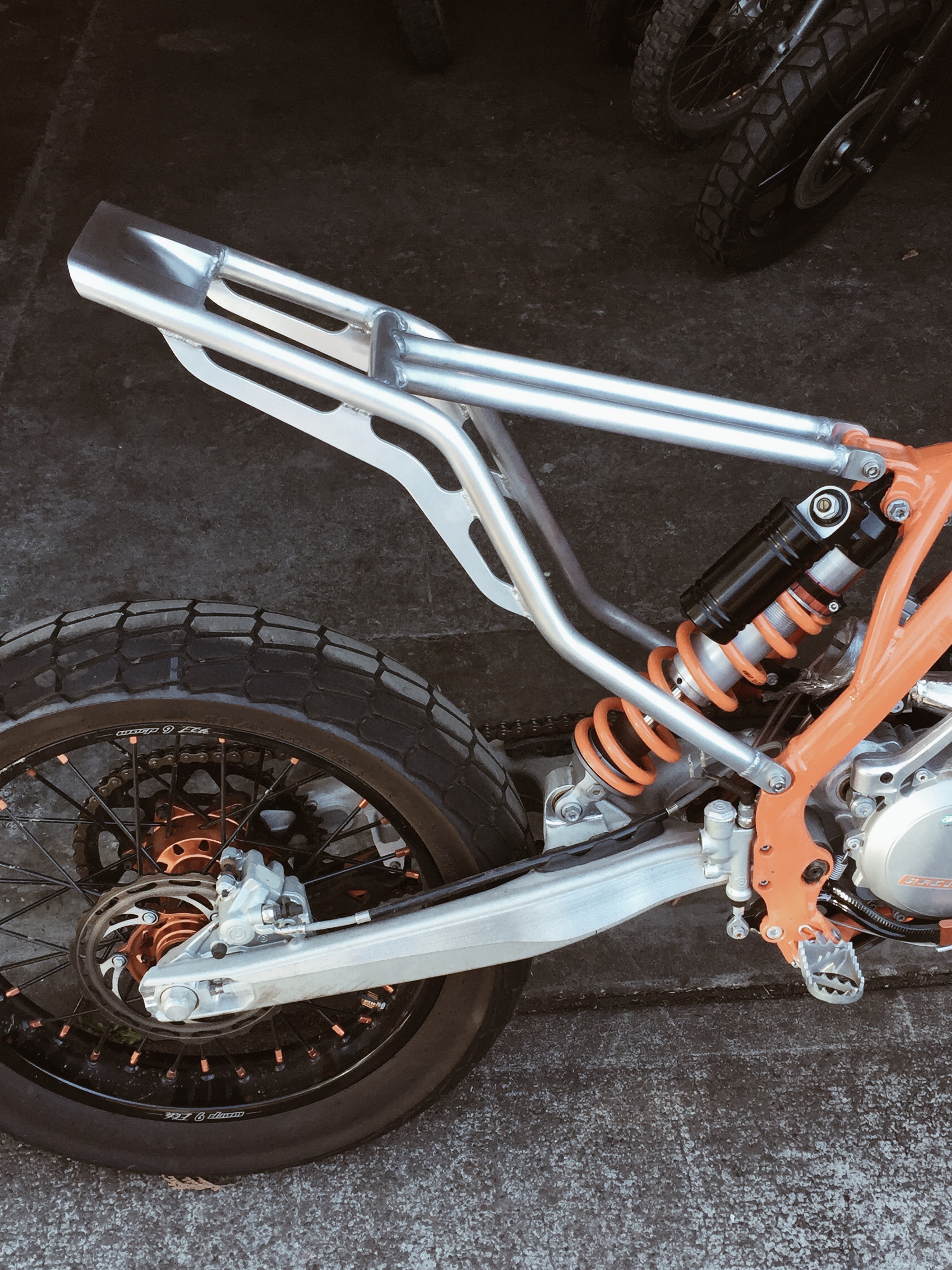
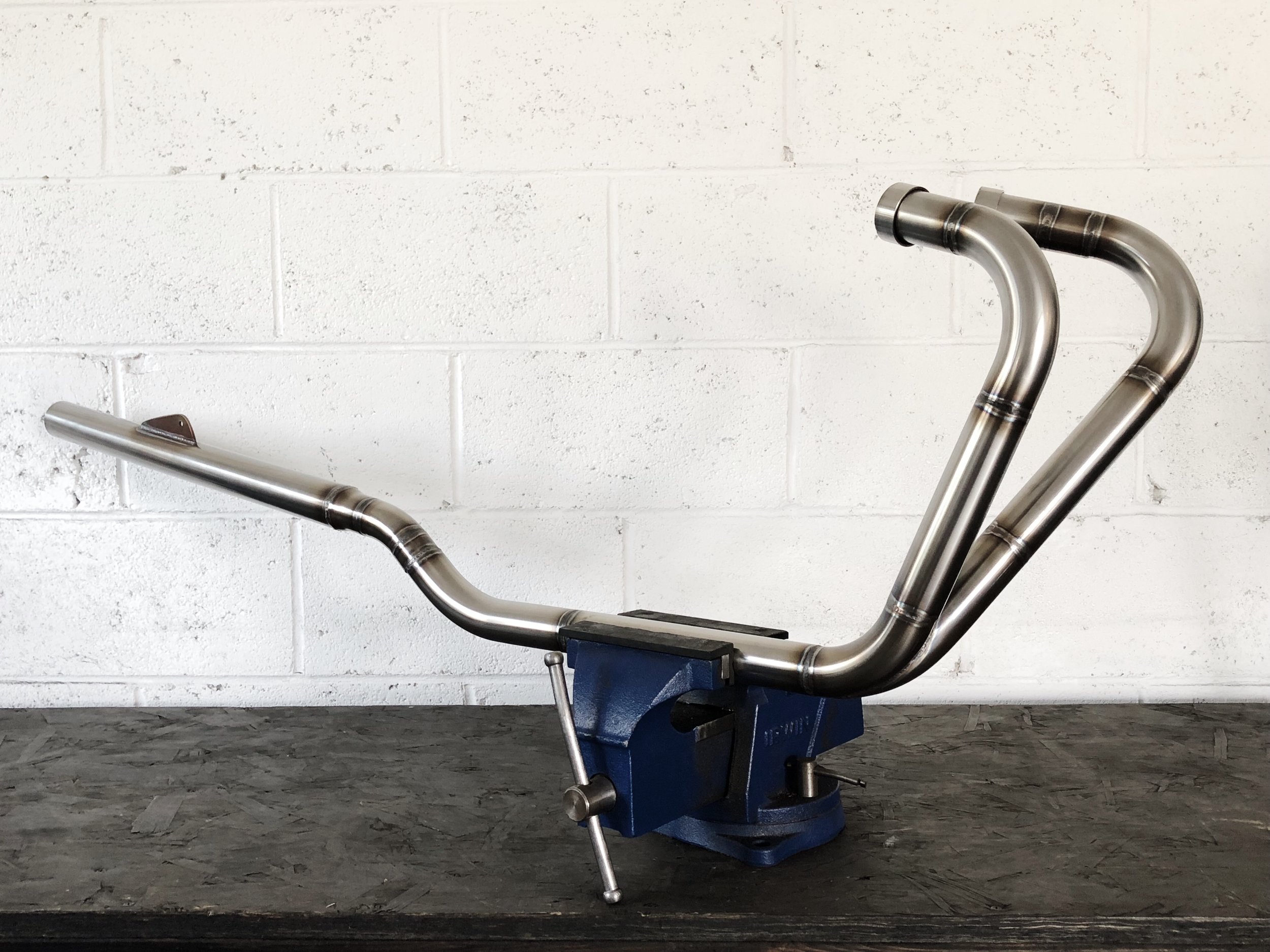
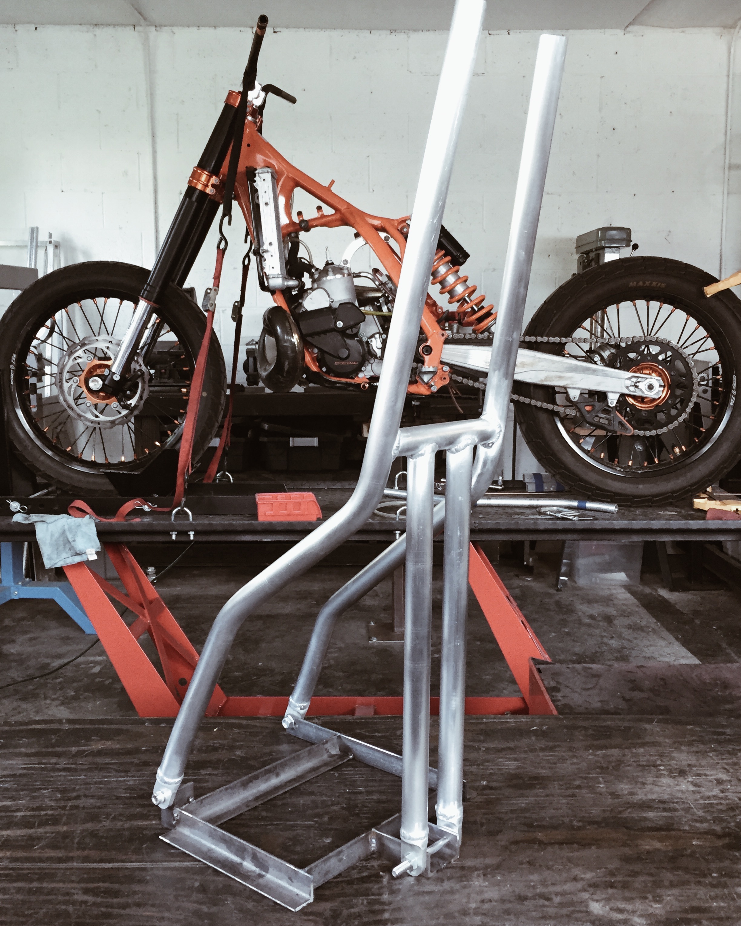
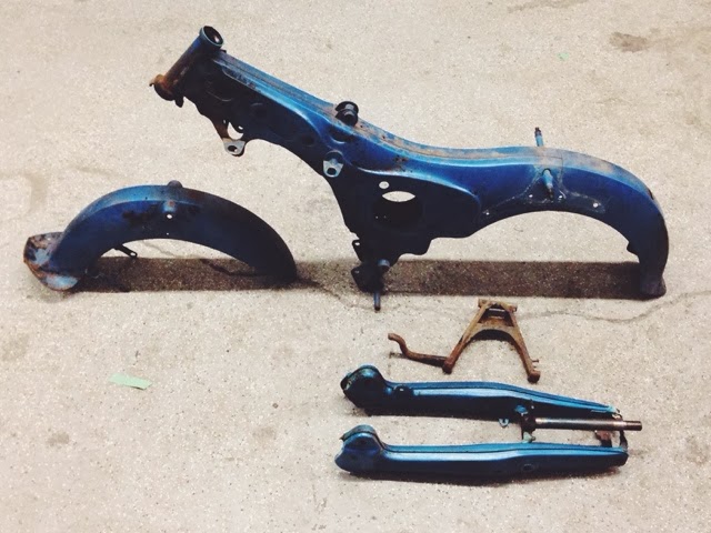
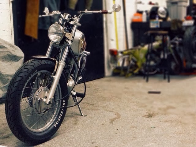
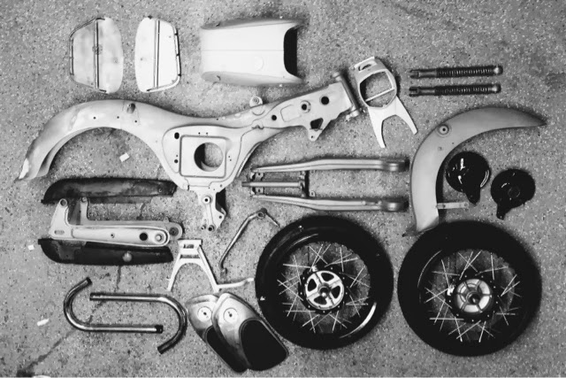
Everything about this build is going to be down to the wire. Keep your fingers crossed and she just may make it to The One Show. For now here's a photographic update:


In your head, try and picture a wood burning stove. What are the elements that stand out the most? What color do you picture it being? What surface texture? What materials? Now think about the details. What type of handle does it have? What do the hinge mechanisms look like? How are the feet treated?
The phrase "Beauty is in the eye of the beholder" defines how difficult it can be to design to someone else's vision. We all see the world slightly different and our personalities lead us to pick up on different aspects along the way. That's why when someone tells you to build a motorcycle based on a wood burning stove it's important to understand what the hell they see in that as a source of inspiration. In the design field you learn to get really good at extracting exactly what someone means when they throw out the phrase, "Make it look more like ____." That skill is what prevents you from presenting a cone at the next meeting when the client meant a pyramid. When the guys at Thrive MC heard the words "Yamaha XS650" and "wood burning stove" they set to work plotting out the elements that would bring these two very different machines into one harmonious artifact.


The Build:
Benny Thomas of BoneShaker started with a 1972 ironhead Sportster frame and motor, the bike needed to be low and fat so he laced a sportster drum brake rear hub to a 16” rim and a later sportster front disc hub to another 16” rim and shod them both with Firestone ANS tyres. A race bike with chunky tyres - what’s all that about? Depends what you are racing on…if you are slamming a quarter mile on a dirt track this bike would be pretty handy.
To keep with the race vibe we went for clip on bars and shortened the forks by 4” and strutted the rear end, Benny Comments…
"I hate master cylinders on handlebars so I set up a master cylinder operated by a cable lever, I didn’t want this set up totally hidden, I like to see working parts, I like to see the cables - the parts that make the bike stop and go."


The body work was designed to be simple, a ‘use what you got’ approach. A Yahama tank was chosen and re-tunnelled to sit on the sportster frame, a bayonet central filler cap was fitted and Benny fabricated a cutout for the carb and throttle cable. A low custom fiberglass tail piece to continue the race vibe was fitted - completing the slammed squat stance.
Benny wanted to do something a little different with the exhaust, he explains...
"something that was tight and industrial looking, I made the high level two into one pipe to sit close to the motor and exit from inside the rear right strut helping to keep the bike compact and strangely narrow whilst looking fat from the rear."
A key theme on the bike is keeping things simple, a few lightning holes here and there, no lights, no bolt on tat, no fancy branded parts, just the raw bones - there is nothing on this bike that it doesn’t need to stop or go - a true Boneshaker.


The Design work:
When it came to thinking about the design aspects of the bike it was felt that any visuals needed to compliment the bikes toughness, its roughness too, so many bikes we looked at were very polished, high gloss versions with bright colours and fun typography. It had to be matt black, all black everything, that flash of white and gold is the only fancy part about the Porkchop. All the imagery on the bike was meticulously hand painted and each illustration has it's own specific meaning.
Mark Graham (Creative Director) at Ilovedust comments…
" it's important that our work has a narrative, but equally as important that it looks good. The '10' painted onto the oil tank represents our 10 years in the game."
Ollie Munden (Lead Designer - Ilovedust) goes on…
" you might notice the 'pray for me' graphic on the tail piece, this is a hopeful sentiment for anyone who dare get on the Porkchop and race it into the desert."
There are odes to old friends past and of course a few of ilovedust's house brand elements with an illuminati nod thrown in. It's very easy to overdo things and the last thing this bike needed was a covering of graphics just for the sake of it. It was very important to have a feeling of familiarity, also a worn in quality about the 'coating'... it's almost like the bikes been inked.
Custom Motorcycles & Design, Portland OR.

portland customs tee - $19.95